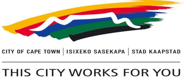
Logo gets green light despite outcry
Cape Town has approved the city's controversial new logo and corporate branding despite resistance from opposition politicians who questioned why councillors were excluded from the “costly” process.
Mayor Patricia de Lille has defended the R8-million logo and said the new branding would “save millions of rands for the ratepayers of this city.” She said that the council had approved a recommendation to overhaul the city’s marketing and branding in 2012.
The city also shrugged off the appointment of its director of strategic branding and communications Carol Avenant, who previously worked as a senior strategist for Yellowwood Future Architects, one of the companies that jointly won the logo redesign tender in December.
The new logo comprises luminous green, black, blue, purple, white and mustard-edged rings with the slogan "Making progress possible. Together” replacing the old motto "This City Works For You."
The design generated criticism from the public who lamented the loss of the city's Table Mountain from the previous design. However the city said that the Table Mountain motif was incorporated into the inner rings of the new logo, whose primary objective is to help Cape Town build a reputation for "opportunity, progress, shared responsibility and inclusivity."
Despite the outcry, independent polls now suggest strong support for the new logo.


